

OVERVIEW
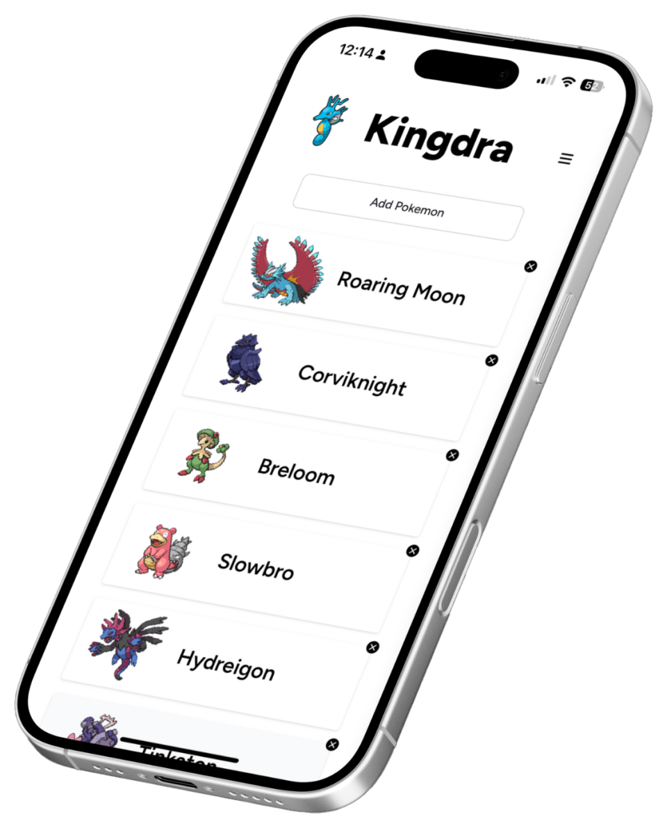
Rebuilding Kingdra for phones first
Following the creation of my Pokemon Teambuilder in June, users testing the web app on their phone ran into a significantly higher rate of bugs and grievances compared to their peers on desktop platforms. Mobile was an afterthought during the initial development process.
I tasked myself with rebuilding the UI for mobile devices, reducing the cost of interaction and easing the cognitive load for users that want to use the application on the go.
These improvements reduced the overall scrolling time between UI elements and significantly reduced time to select Pokémon for a given team.
CONTEXT
Desktop-first development left mobile users stranded
In June of 2024, I started development for this Pokémon Teambuilder project as a way to learn Next.js and build my first real full-stack application. The project was a lot of trial and error, and I spent a ton of time linking up database schemas, calling APIs, and writing the core logic.
All of which allowing the Teambuilder to mimic the math that the core Pokémon games use to calculate stats. After deploying the app, I enlisted the help of my Pokémon fan friends to test the app. One problem was clear immediately.
The mobile experience was absolutely horrendous.
They initially tested the app on their phones, because why wouldn’t they? Mobile users make up over 60% of global internet traffic. Many of them were running errands when I posted the question in the Discord, and thought they could check it out really quick on their break.
The interface forced them to scroll for entire seconds to find the Pokémon they were looking to find, and the infinite scrolling feature significantly favored desktop users, who could leverage the width of the screen to quickly scan for the Pokémon they wanted.
The message was loud and clear. The UI needed to be rebuilt with portable devices in mind.

 Scroll me!
ROADBLOCKS
Libraries, S-curves, and missing depth
There were a few issues right out the gate…
Component Libraries
The S-Curve Design
Lack of Dimensionality
CONSIDERATIONS
Hover, feedback, and hierarchy on a small screen
Interacting with the web is radically different on mobile devices.
Hover State Alternatives
Interactive Feedback
Information Hierarchy
NAVIGATION
Two prototype directions that never fully landed
After brainstorming a bit, I started prototyping some layouts, neither of which I fully loved.

Bottom Tab Bar
Easily accessible for one-handed use, familiar to iOS users, clean and minimalist glassy interface
Can't see added Pokémon without switching tabs, not enough features to justify multiple tabs

Icons Up Top
Keeps bottom navigation clear for content and eliminates need for sidebars or nested menus
Hard to reach with one hand, confusing to new users who may not know what the icons do
ADAPTATIONS
Concrete UI moves that reduced scroll and friction
After settling on a layout that worked, I immediately jumped into Tailwind to make some adjustments.

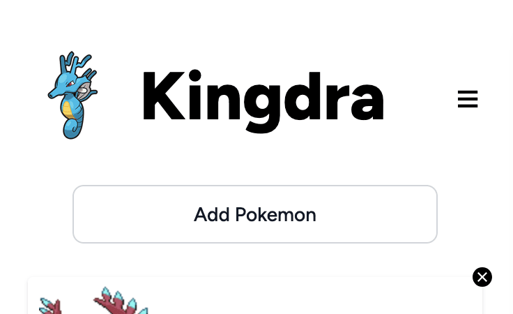
Hamburger Menu
Replaced the fixed infinite scrolling navigation with a collapsible hamburger menu to save valuable screen space. This mobile pattern is familiar, while maintaining full functionality.
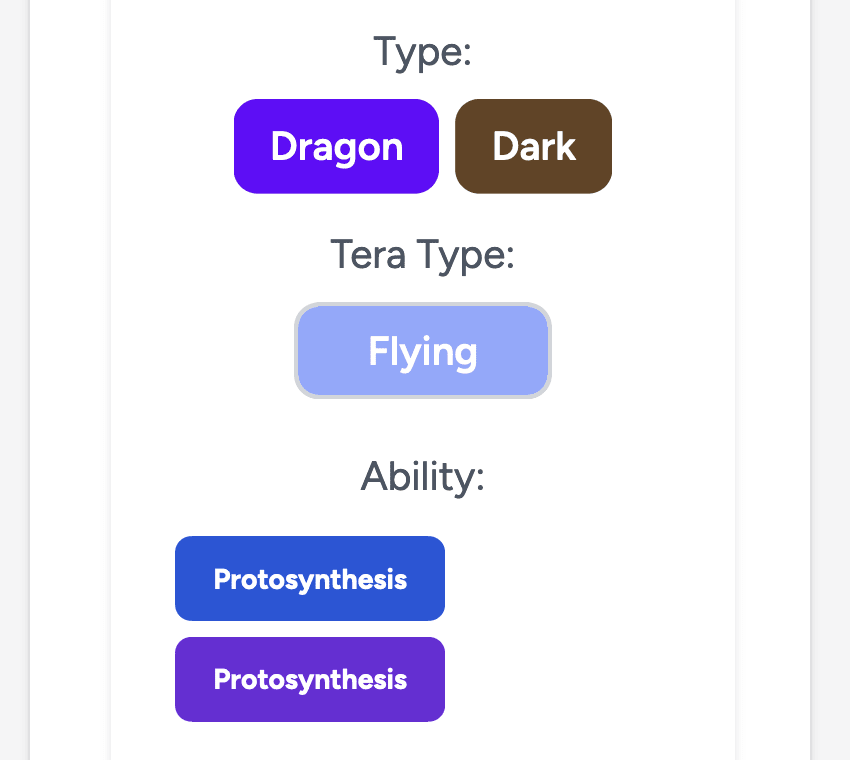
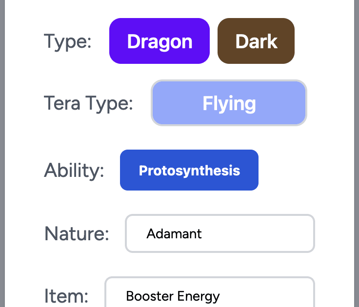
Margins
Optimized margins for mobile screens while preserving touch targets and readability. This allowed for more content to be visible at once, especially within modal interfaces.


Convert Tabs to Dropdowns
Transformed the horizontal tab system into dropdown menus to prevent line breaks and maintain filtering options in a mobile-friendly format, which was particularly useful for the Pokemon selection interface.
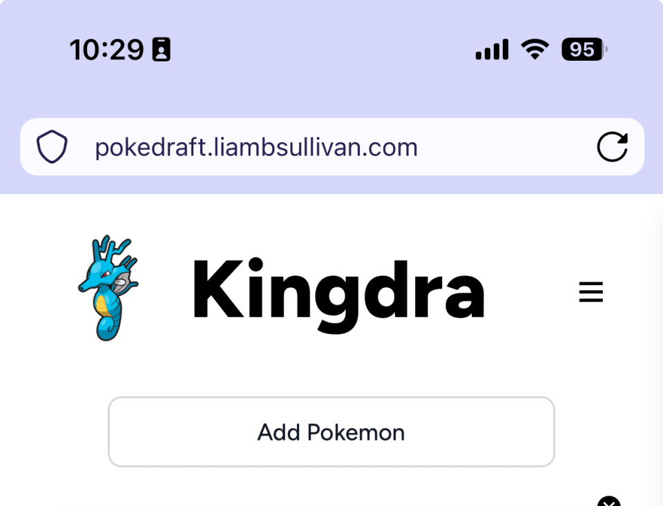
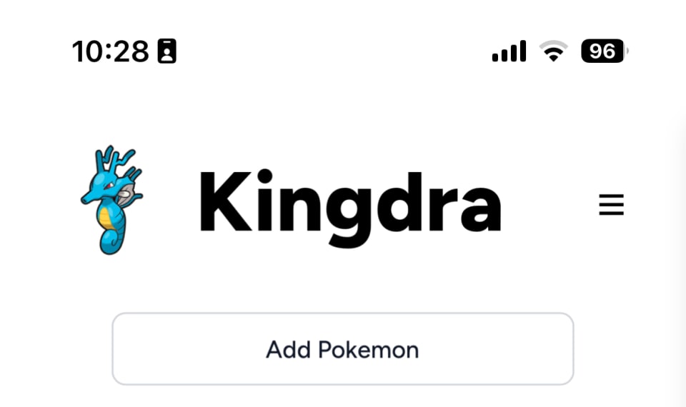
PWA Migration
Enhanced the mobile experience through PWA implementation, enabling app installation, faster loading times through caching, and improved performance with reduced server-side operations.


"Add Pokemon" Button + Modal
Replaced the spread-out Pokemon selection interface with a focused full-screen modal, accessible via a single “Add Pokemon” button. Features touch-optimized controls for filtering and searching.

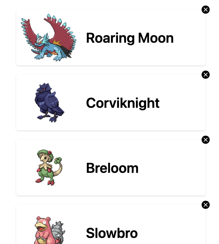
Horizontal Pokemon Slots
Converted the grid layout to a horizontal list, making team management more intuitive on mobile and increasing the Pokemon editor’s touch target. Provides a natural scanning experience from top to bottom.
FLOW
How the rebuilt mobile experience comes together
So how does this all come together?


RETROSPECTIVE
Lessons from converting a desktop tool to mobile
Converting the Kingdra Teambuilder to mobile revealed valuable lessons about responsive design. What began as a simple port evolved into an exploration of mobile UX patterns and the complexities of adapting desktop functionality to smaller screens.
The Component Library Dilemma
Rethinking Touch Navigation
The PWA Game-Changer
Going forward, the type coverage module needs to be re-implemented. In the current horizontal list implementation, displaying it on mobile is simply not feasible yet. A gesture-based system could make this desktop-optimized tool more accessible on mobile devices. Enhanced filtering options by types, stats, and moves would improve the user experience, especially on mobile and tablets where screen space is limited and only two columns of Pokemon can be shown at one time.
Future development will focus on replacing Flowbite components with custom, device-agnostic solutions to improve flexibility and maintainability. By removing these dependencies, I’ll have much more freedom in creating custom layouts.